UiFlow interface suggestions
-
I noticed a few days ago you had consolidated many of the menu items such as examples and docs and they were located under the 3 bar icon but now those items are placed outside of the pull down menu. I thought having those items under the main menu was much cleaner and clearer. Also when you click on the docs link it only has links to chinese and japanese documents but when you click on the settings icon you can download the docs in other languages. This is confusing and it seems like there should only be one link to uiflow documents as well as links to m5stack documents. Regarding your documents I really appreciate the much needed efforts into developing better support documents but I am often having to go to the previous docs you started writing in order to find information that is missing from the current reference doc. For example, under API you only have links to LCD and speaker but at https://m5stack.readthedocs.io/en/master/api-reference/index.html you have links to several of the other exposed functions. I just wanted to point these issues out.
I would also like to request under the hardware blocks you expose the mic on the m5go and fire much like you exposed the speaker. It makes sense there be a block to quickly access the input value coming in on the mic.
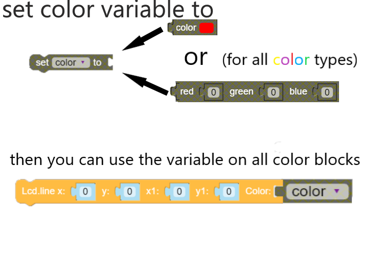
Also it would be really great to change the way color is defined in Uiflow. The main reason I am asking for this is that you only offer the color swatch on the graphic blocks and I need those blocks to have red,green,blue number values. At the moment you have some blocks that use color as a color swatch and others that use color as a number for red, green, and blue.

I think this can be consolidated into a color variable that can be defined using either the color swatch or the red,green,blue numeric values and then this color variable can be used where ever color gets defined.
-
All very good suggestions that I have also voiced myself, I often go back to the read the docs to look at the micropython API which is essentially just a copy of loboris's api. I wouldn't have thought it would take much effort to copy and past this stuff to the new docs but maybe I'm wrong, I have a github account and I'm a contributor on our github, but I still haven't got my head around why it's so difficult to edit these documents, I'd happily do it in a heartbeat if I knew how. I'm left with editing the documents offline and then waiting for someone to eventually upload it to the main docs pages.
Great idea about the colours, we should aim for consistency. Have you noticed the new custom blocks function in the latest version of Ui flow, I think its a great step in the right direction and I'm thinking about how best we can streamline and manage any new interesting blocks our community comes up with. I'll be taking a good look through all of the blocks in Uiflow for bugs and potential improvements over cny and preparing a doc to present to the team after the holiday, would be happy to hear of any other suggestions you have.
Best
Lukas
-
@lukasmaximus
I tried out the custom blocks last night and it's a great addition. Microbit did this with their makecode blocks and it's allowed all sorts of great new blocks to get developed. Here is a note on how they implemented block sharing and development. Might be worth looking it over to see how they approached this matter. I'll try and see if I can make the color blocks. I can definitely do a mic block. I do think since the mic is exposed in the API it should be exposed under the hardware blocks as should SD blocks be exposed. I am sure this and many more things are in the works and it's great to see all the developments you are all making.
https://makecode.microbit.org/blocks/custom
https://makecode.com/defining-blocks
thanks for responding -
@jpilarski said in UiFlow interface suggestions:
I noticed a few days ago you had consolidated many of the menu items such as examples and docs and they were located under the 3 bar icon but now those items are placed outside of the pull down menu. I thought having those items under the main menu was much cleaner and clearer. Also when you click on the docs link it only has links to chinese and japanese documents but when you click on the settings icon you can download the docs in other languages. This is confusing and it seems like there should only be one link to uiflow documents as well as links to m5stack documents. Regarding your documents I really appreciate the much needed efforts into developing better support documents but I am often having to go to the previous docs you started writing in order to find information that is missing from the current reference doc. For example, under API you only have links to LCD and speaker but at https://m5stack.readthedocs.io/en/master/api-reference/index.html you have links to several of the other exposed functions. I just wanted to point these issues out.
I would also like to request under the hardware blocks you expose the mic on the m5go and fire much like you exposed the speaker. It makes sense there be a block to quickly access the input value coming in on the mic.
Also it would be really great to change the way color is defined in Uiflow. The main reason I am asking for this is that you only offer the color swatch on the graphic blocks and I need those blocks to have red,green,blue number values. At the moment you have some blocks that use color as a color swatch and others that use color as a number for red, green, and blue.

I think this can be consolidated into a color variable that can be defined using either the color swatch or the red,green,blue numeric values and then this color variable can be used where ever color gets defined.
Nice suggestion, their colour system would certainly simplify things quite a bit.
-
I have a few more suggestions.
- It would be great to be able to add comments in uiflow. Microbit has this option and it's very helpful.

- It would be great to be able to double click on the canvas and type, at which point a list of the common blocks with that typed letter would be listed and able to be selected for use. This would allow the user to more quickly access the blocks required and to stay in the flow - no pun intended. Here is an example in grasshopper.

- It would be great to be able to add comments in uiflow. Microbit has this option and it's very helpful.
Hello! It looks like you're interested in this conversation, but you don't have an account yet.
Getting fed up of having to scroll through the same posts each visit? When you register for an account, you'll always come back to exactly where you were before, and choose to be notified of new replies (either via email, or push notification). You'll also be able to save bookmarks and upvote posts to show your appreciation to other community members.
With your input, this post could be even better 💗
Register Login